iOS or Android? Perhaps, in a galaxy far, far away, everyone uses the same operating system and lives in relative peace and harmony. But here on earth, it's a different reality.
It used to be that a phone was intended solely for making and receiving calls. There was no Snapchat. No Instagram. But the digital revolution has completely redefined the mobile landscape. With an app for literally everything, we are always just a click away from never-ending opportunities.
Why design makes a difference
Competition in the mobile industry is cutthroat and developers have to do more than just their best to deliver a product the target audience will truly love. An appealing design is vital when it comes to users' app choices. Steve Jobs said, "It's not just what it looks like and feels like. Design is how it works."
Indeed, designs about a killer user experience too. Both Android and iOS have their own unique styles and tons of visual goodies to please not only our eyes, but also our minds
The two major mobile operating systems turned ten recently, so it's a great time to go on a nostalgic journey through mobile app design history and the visual app revolution that pushed the boundaries of possibility.
Apple vs. Google: The mobile frontrunners' league
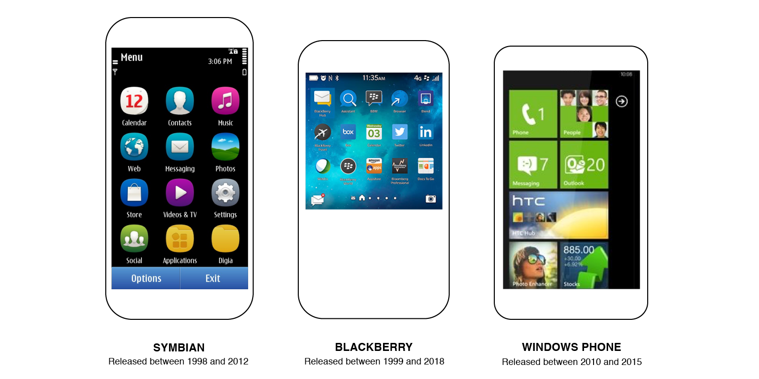
At the beginning of the 21st century, two names - Apple and Google - officially entered the race to become the top-rated operating systems. There were others racing along as well. But Symbian, Blackberry, Windows Phone and all the other didn't manage to succeed.

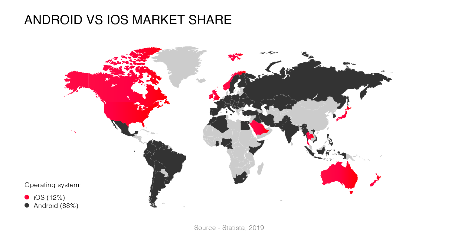
After many ups and downs and all the different players, Android and iOS now represent almost 100% of the global mobile market share.

Mobile app design: The good old days...
The early iOS visuals
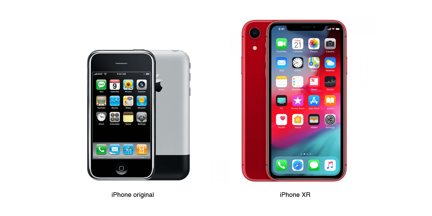
Millennials and mobile application design geeks definitely remember the Apple Worldwide Developers Conference in 2007. That's when Steve Jobs introduced the first iPhone. Shortly after, the Apple App Store went live featuring nearly 500 apps. At that very moment, mobile app design began to evolve rapidly.
Initially, Apple pushed for skeuomorphic design. Skeuomorphism is a design concept that involves rich emotional experiences taking characteristics from real life objects and applying them to digital interfaces. For example, the original Apple Notes app looked like a lined notebook and the calculator looked like a real calculator.
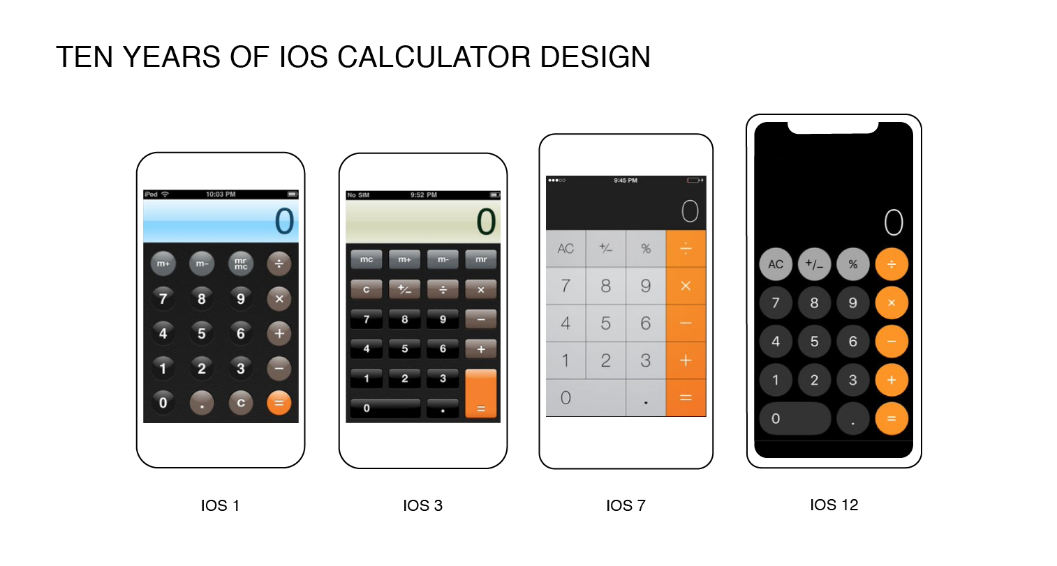

With the launch of iOS 7, Scott Forstall, who was responsible for iOS design for a couple of years, left the company and took the idea of skeuomorphism with him. Soon after his departure, Jony Ive, Apple's Chief Design Officer, started to propel the concept of "human interfaces" and flat design forward.
Importantly, flat design underpins the absence of multidimensional elements, thereby giving the impression that all the objects are laying on a single surface.
Minimalism and a focus on user experience were at the heart of Apple's new visual philosophy. With flat design, the company said yes to lean and crisp user interfaces and waved goodbye to such stylistic elements as glossy icons, colorful gradients, textures, and shadows.

Let's illustrate this shift with Facebook, one of the first and most popular iOS apps.
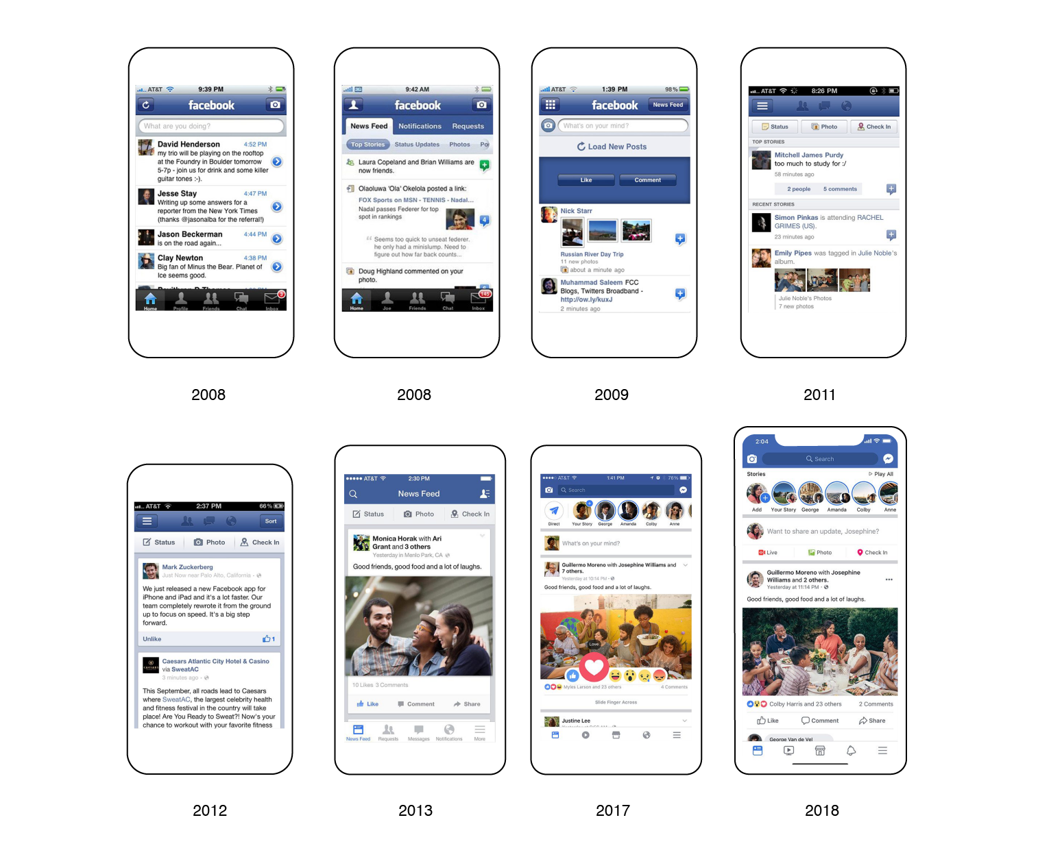

As the images above show, the original design focused on 3D style. Then, 3D buttons were replaced with flat images and text was reduced to a minimum.
The dawn of Android design
Android was released in 2007, with the first version, Android 1.0, unveiled in September 2008. Since then, the operating system has gone through multiple sweet (literally) releases, with the current 9th version called "Pie", which was launched in August 2018.
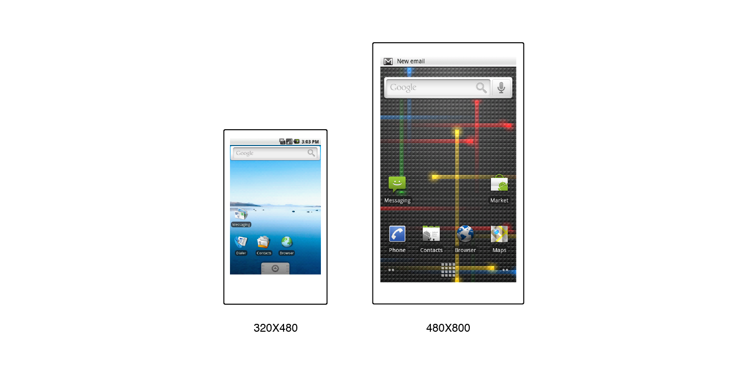
Unlike iOS, Android didn't adopt its own design language at the very beginning. Early versions of Android had a basic, functional (sometimes too functional) look. You would have certainly had the feeling of deja vu looking at the Windows-style icons and the overall old-fashioned interface.
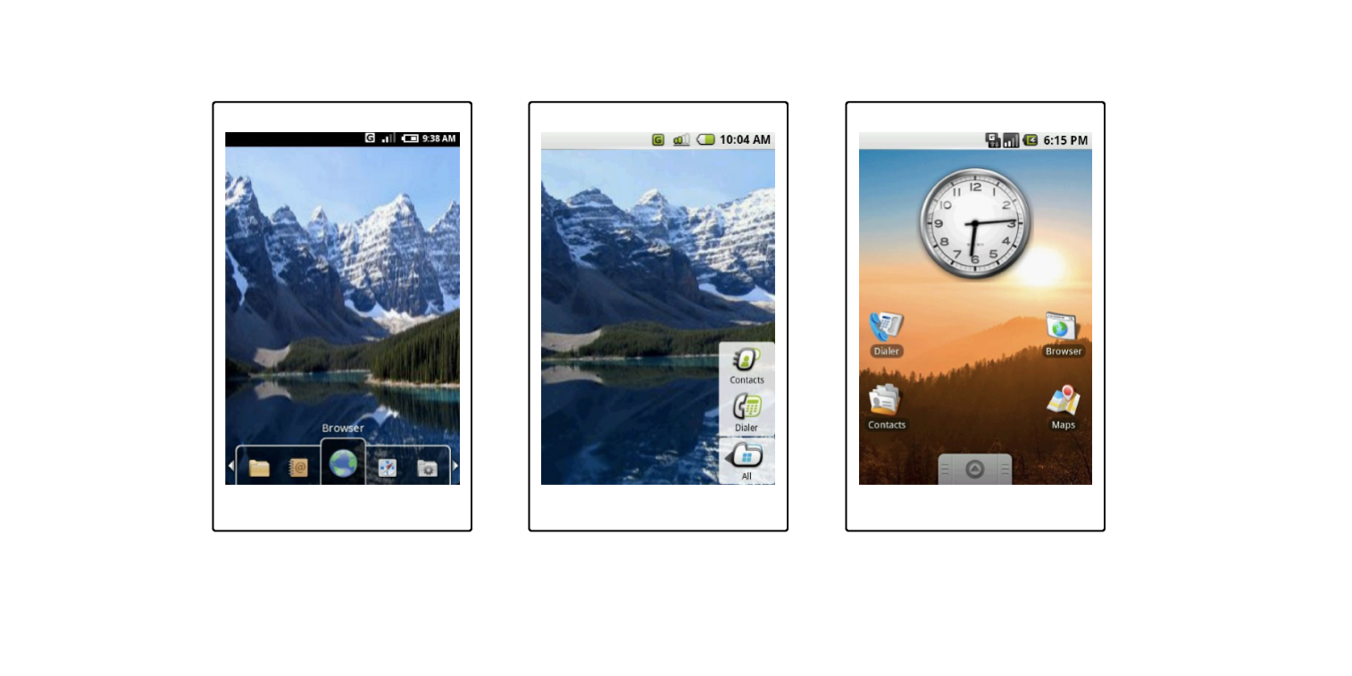

Before Android "Eclair" 2.0, there were almost no changes in the system's design. Nevertheless, with a new 854x480 display — one of the earliest and biggest wins for Google — Android reached the next design-driven stage, taking one step closer to its present-day look and feel.

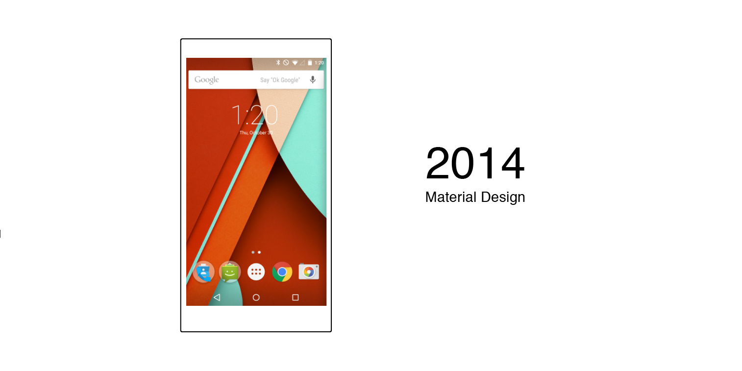
In 2014, Google refocused on Material Design. New guidelines followed a more coherent, layered "paper" approach. It boasts responsive animations and transitions, padding, and such effects as lighting and shadows to add more depth.

Mobile app design: The time is now
Google and Apple still continue to make history in mobile app design with their one-of-a-kind visual languages. Let's compare the key differences between iOS Human Interface and Google Material Design guidelines.
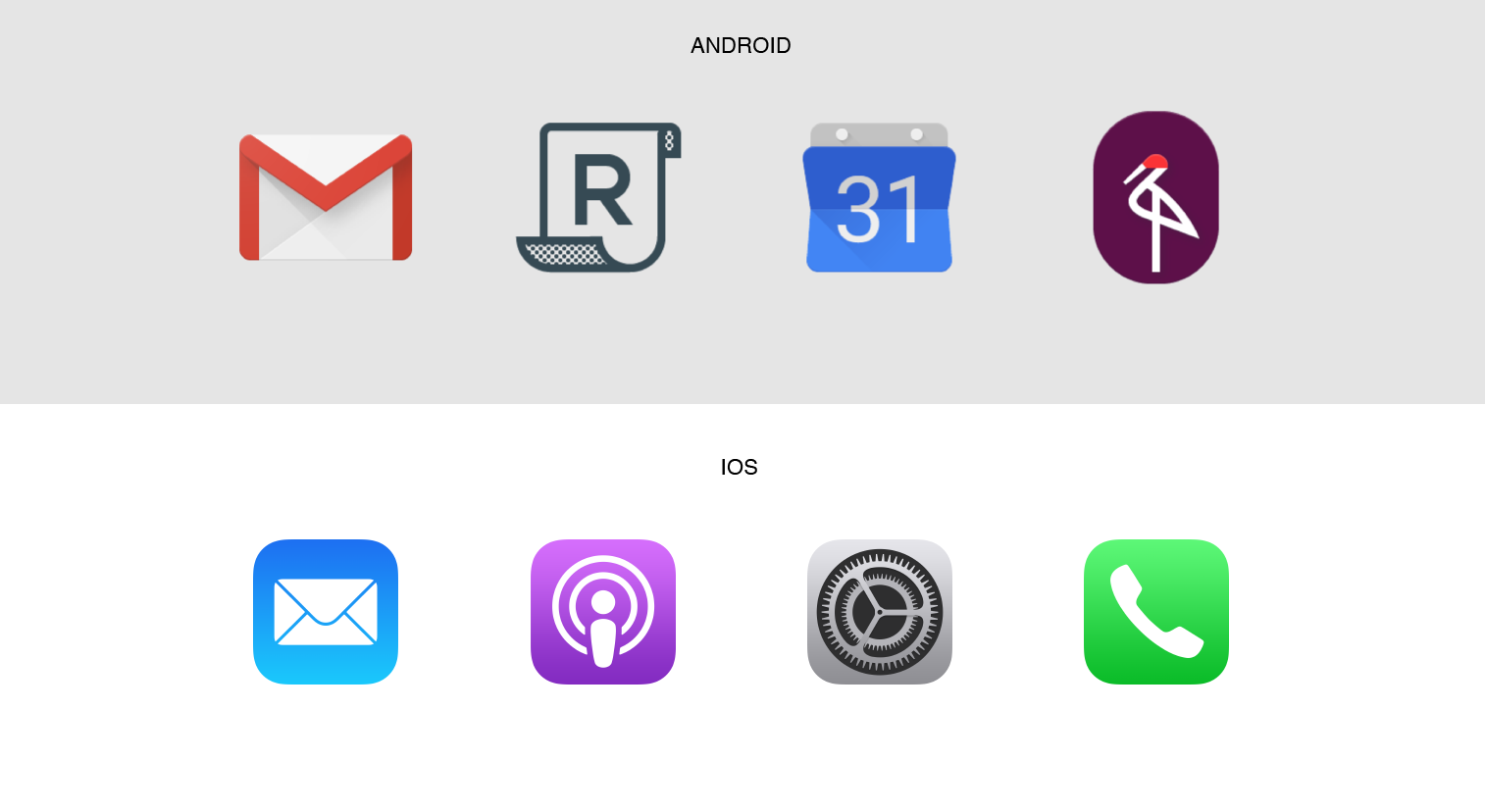
Product icons
As app icons represent the main idea and purpose of a product, every icon should be customized, yet consistent with the whole system.
iOS icons are square and rounded in the corners. Apple recommends avoiding transparency, simple backgrounds and the use of photos, screenshots, or interface elements.
Oppositely, Android provides for any icon shapes that fit the defined area.

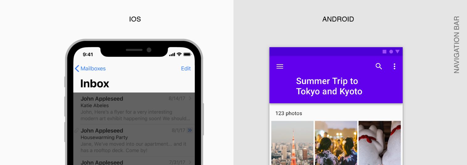
Bars
The status bar appears along the upper edge of the screen and features such information as the time, network provider, and battery level. On Android, data is shifted to the right, and iOS distributes it along the bar length.
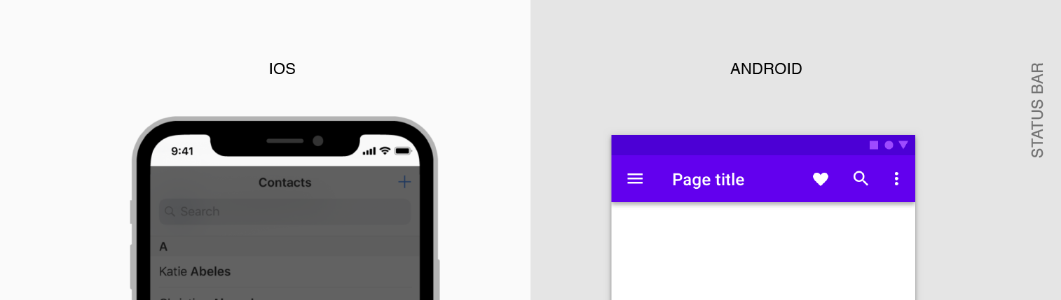

A navigation bar goes below the status bar and displays the name of the current page or app. There are cases when the right side of a navigation bar includes a control, like Edit or Done buttons. Android places it to the left, and on iOS it is centered.

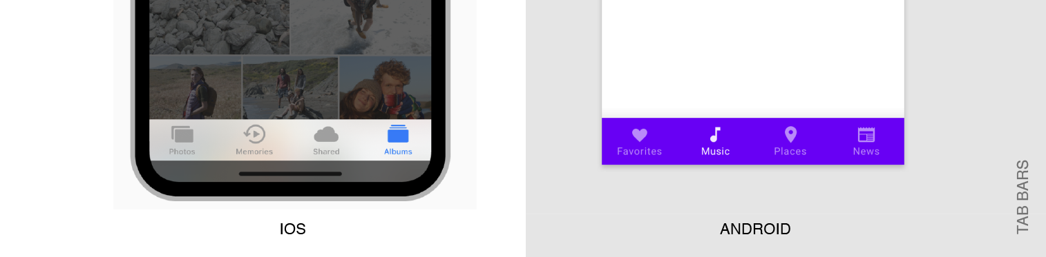
As for tab bars, which are used for in-app navigation, here Android and iOS also have different views. Material Design allows for top or bottom arrangement with no more than 3-5 segments, while iOS offers bottom tap navigation with maximum of 5 segments.

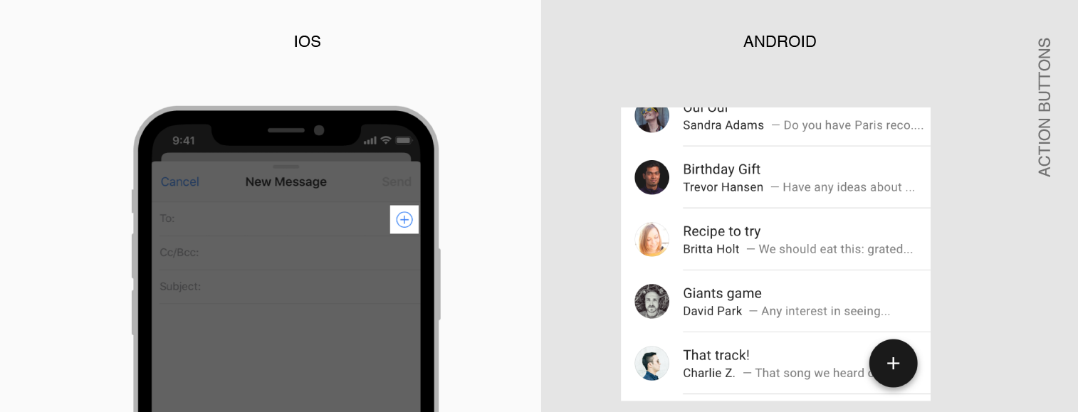
One of the most peculiar features of the two mobile operating systems is the presence of floating action buttons (FABs) in Android and call to action (CTA) buttons in the iOS apps. FABs represent the primary action in an application — for instance, the new post button in social media apps. FABs are positioned in the right bottom corner or at the junction of two areas and that makes FABs more eye-catching. The FAB’s analog, a call to action button, is usually located in the upper right corner or in the center of tab bars (Instagram).

Typography
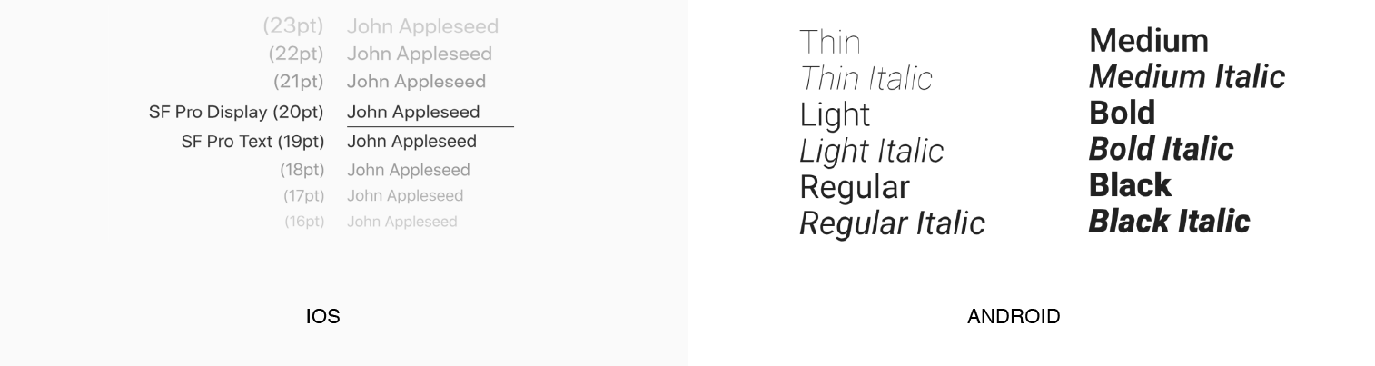
Each OS has its own default fonts to create a sense of consistency and improve brand presence. Roboto is the Android typeface used for any text below 14sp. iOS applications, in their turn, should use Apple's San Francisco font applied in 2 variants, i.e. SF Pro Text or SF Pro Display.

Mobile app design: Back to the future
As our time travel comes to an end, we cannot help but think about what lies ahead for mobile app design.
Though flat visuals still dominate, the release of new devices and wearables together with the addition of new screen sizes will push design trends to adjust to the ever-changing tech landscape.
In addition, in the two-to-five-year time horizon, Material and Human Interface design will be open to interpretation, since Google and Apple now want to give users more tools for liberal customization of design systems.
Thus, we are sure that two biggest tech giants will challenge themselves to elevate customer experience higher and higher, which will inevitably turn into the groundbreaking UI and UX solutions.